Everybody is always talking about their tools. It makes sense, they’re how we get work done. We become intimately acquainted with our tools. Everybody has them. Caitlin, my wife, is a nanny; her tools are car seats, bottles, and baby monitors. My Dad is well versed in SQL and a lot of other technologies I can hardly understand. I’m under contractual obligation not to discuss many of the tools I use at work making videogames.
I just realized how many bloggers have a section in their about page describing their tools. They describe how they create and maintain their blog. I’ve never really talked about what I’ve used to build this site, because honestly it isn’t spectacular. In fact, if anything, it’s remarkable how primitive the tools are that I use to write here, maybe even a little embarrassing. Here goes.
Hosting – Since around 2000 this site has been hosted by Ryan, a friend of mine from high school on a server at his house, sitting in the closet. Last I knew, it was a dual-Pentium II running Debian Linux. I don’t know how much space I’m using, he’s never complained that I’m using too much and has always been extremely generous. Ryan has promptly helped me on a number of occasions with support for adding my domain, helping me setup a database for my CMS software, and any problems I seemed to be having. He’s an IT genius, and I literally can’t begin to comprehend how his brain works so well. Surprisingly enough, I have had less down-time in the entire period since 2000 than Tumblr had last week. Granted, I don’t really generate loads of traffic, but Ryan’s server has met my needs remarkably well.
Expression Engine – For my CMS, I’ve been using Expression Engine v 1.6.7 since about February of 2009. I’ve never updated it. I’ve never really cared to. Mr. Sperte convinced me to start using it after blogger went through a period of nearly a month where I couldn’t post anything from my account (it was an issue that affected only a few users). Before blogger, I had used an app that I wrote myself which let me inject posts directly into the html of my homepage from a console window. As you can see, my needs haven’t been very complex.
HTML Editor – This will make some of you cry. This very moment, I’m creating this post in a standard text field in Google Chrome using the Expression Engine web interface. Not only is there no syntax highlighting, but there is no fixed width font and the lines wrap. Sometimes, for the longer posts, I will draft them in Simplenote (also the web interface), TextEdit, or even [gasp] Notepad, but that’s generally for the purpose of saving my work rather than enhanced functionality.
File Hosting – Every once in a while I want to embed an image in a post. Generally, I would just upload it to my /images directory using my favorite free FTP client — Firefox with the FireFTP extension installed. But lately I reserve that for images that are part of the site itself. For images in posts, I just upload them with Droplr or into my public folder in Dropbox, and just hotlink the image itself, which is very likely against their terms of use.
Design – Nothing. This site has never had a mockup that I can remember. I change the design incrementally when something gets on my nerves. And I do it live to the HTML, CSS, and Expression Engine templates. When I first switched to EE the site was quite a mess. It was basically the default EE setup with all the formatting ripped out. It’s gone through a cascade of minor changes in a constant pursuit of simplicity. Recently, with the removal of comments, I’ve become pretty happy with the form and function of the blog.
I’ve come across a lot of great tools, but I never feel like I get the same value out of them as other people do. My computing needs change all the time, and I like to be as flexible as possible. For instance, I keep all the major web browsers installed on my computer. It’s not so that I can test on them, but because they constantly leap-frog eachother. I don’t like to get locked into one, because I know another one will become more attractive to use at some point.
I can’t really think of a good closing paragraph, so I’ll conjure my junior high self to round out this post — and those are all the tools I use to write this blog. The End.
Sean just posted some comments about Taptivate’s new Friends app for iPhone that came out today. He doesn’t like it much, and I agree completely. His closing comments:
Every issue I have with Friends boils down to this: Friends doesn’t solve any problems for me. If anything, it creates them.
It’s the truth. All the coolness that could have come out of unifying how I interact with my friends in one place seems to be lost somewhere between the icon and the first screen of this app. As I noted in the comments on Sean’s post, I’m left envying something like the Windows 7 People Hub. It’s a very well considered solution. Friends just leaves you wondering what is supposed to make it better than using your dedicated apps for these services.
In case you’re wondering where I’ve been the past few weeks, I got married to Caitlin Jean! We had a wonderful wedding and honeymoon, and are getting settled in our new home. I’ll be getting back in the swing of things over the next few days, in the meantime enjoy the following.
If you’d like to check out the slideshow from our wedding I’ve posted it here. Also, here is Amazon’s top-selling Nintendo DS list from Black Friday weekend, which I find pretty exciting.
Google is very diligent at parsing all the breadcrumb trails of my online existence. Lately however, I’ve been finding myself confronted with ads for goods and services I already own or use, and don’t help to be promoted over and over again.
Engagement and wedding band ads are no longer relevant, having already purchased from the very shops placing such ads. Google is smart enough to know I was looking for them, but not smart enough to know I’m not anymore.
Having received more emails from my bank recently, I’m now seeing ads to open accounts that I already carry.
Believe it or not, I don’t mind reasonable advertising. It’s been a small price to pay for the services I get online, but targeting me with ads for things I don’t need can’t be a good value for advertisers.
You must have Adobe Flash Player installed in order to view this site.
I read it as:
You must hamstring your computer with Adobe Flash Player in order to fully subject yourself to this abomination.
To be fair, it isn’t all Adobe’s fault. Much of it stems from years of having their platform abused by “web designers” who couldn’t tell Caslon from Comic Sans. However, it makes me happy to see such warnings less frequently.
Initially, having an App Store on the Mac looks like the beginning of the end of the “open” environment of OS X. But if the App Store on Mac proves to be successful (despite the fact that it currently has an open environment for installing apps), it actually seems more likely for iOS to be opened up as well. If the App Store is a draw for developers on the Mac, then it’s unlikely that most developers would abandon the store on iOS even if it became an open environment as well.
PlainText – Dropbox text editing is yet another text app that recently found it’s way onto the App Store. Dropbox1 syncing might not seem like a big enough deal to put in the name of an app, but it might just be the new killer feature.
PlainText presents you the option to pick a “Linked Folder” to place in Dropbox that it will use for syncing all your text documents. Any new files or folders you create in the app utilize this as if it were the root directory. Your text is now shared with all your Dropbox accessible devices. But what makes it really shine? Folder sharing.
For a while I’ve wanted to have a text service to share notes with my fiancé. We could share a single SimpleNote account, but we’d be sharing lots of unnecessary notes that aren’t relevant to both of us. With PlainText and Dropbox this is really simple. All we had to do was make a shared folder and store it under each of our directories that are linked to PlainText.
Now we have a folder to put our shared text files. Any changes we make get synced with each other seamlessly. In the rare event that file collisions occur, Dropbox is already set to handle things smoothly. We can freely share and collaborate with wedding plans, grocery lists, notes full of <3<3<3's and :D :D :D's. What's more, we could each have similar shared folders with any of our friends, groups, teams from work, etc. This becomes a wildly valuable way to share information.
Dropbox folder sharing is an incredible low-level feature, and I think apps that use Dropbox for syncing data are going to see a huge value added bonus from this kind of functionality.
Use this link to sign up for Dropbox and get us both extra space.↩
Counter is a simple iPhone web app I’ve made for a simple task, counting. It mimics the old hand counters used for counting crowds at events. If you want to check it out just visit chuckskoda.com/counter from an iPhone or iPod Touch to give it a go. Not sure it has very wide appeal, but if you need it, I hope it comes in handy.
Here’s something fun I woke up to this morning. It’s a new cutout animation music video for Jeremy Messersmith’sTatooine that chronicles the entire original Star Wars Trilogy.
This mockup looks like a great direction for iChat to me. I’ve been really frustrated with the crazy non-unified-ness of iChat. Having multiple contact lists for every service is insanity.
Here is a little user interface venting I’ve been meaning to get off my chest. A few weeks ago iTunes 10 was released to a fanfare of ‘meh’s. It had some new-fangled social networking feature called Ping, or something. I’m not here to talk about that. Social networking is so 2009.
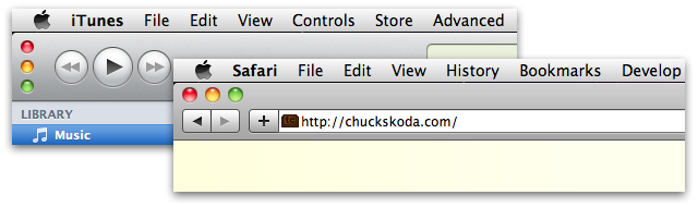
What was disconcerting were the weird vertical close, minimize, and zoom buttons seen here:
Windows are one of the primary system-level components of a desktop operating system. Key examples of this type of component are windows, check boxes, radio buttons, sliders, scroll bars, menus, preference panes, etc. Components at this level exist to enforce platform consistency. This yields familiarity and ease of use. User interface features are elevated to this level when they have a certain degree of importance. For instance, there probably wouldn’t be a standardized scroll bar if it would only be required by one application out of a thousand.
When Apple released the beta of Safari 4, some may remember that it featured tabs on top. Basically, there was no title bar. The space typically occupied by the title bar was now allocated for tabs and divided between them. Taking over the title bar space, common to all main application windows, suggested that the title bar wasn’t important. It’s useful to some applications, but isn’t really necessary for all of them. If something else is more suitable in that space for your application, then have at it.
However, in actuality, title bars are important. They make the window recognizable, contain a title to identify their content, and have a consistent click-able area to move and manage the window on your desktop. Those were all compromised in the beta version of Safari 4. There was an outcry from many users, and the feature was cut from the final release.
These window buttons in iTunes are no different. They are a consistent element in application and finder windows for a reason. iTunes has been Apple’s test bed for unique (read: bad) interfaces for quite a while. Is it any wonder it’s their most complained about and kludgy application?
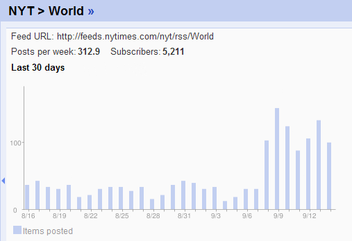
Lately my “General News” folder in Google has been flooded with stories. Upon doing some digging, I’ve discovered that just a few days ago The New York Times started posting a huge number of stories as evidenced by this graph (edited for relevant information) from Google Reader. This is true of their World and U.S. news feeds both of which I’ve been following for the past year or two.
This looks like a huge increase of roughly 3-5 times as many stories per day. Even before this increase the feeds from NYT were pretty bloated, and I ended up doing more skimming than reading. Who finds all these stories to be relevant? Certainly I don’t. Neither do I have the time to skim the titles anymore. Unsubscribed.
This has gotten me thinking about the fact that most of the news I read is curated by the community of friends I keep on Twitter, Facebook, and the personal blogs that I follow. This represents a fundamental shift in acquiring news. In a sense, I’m using my friends as a relevance filter on the massive amount of data posted online everyday. More and more editorial content is coming from trusted friends, rather than some writer on a payroll. I feel that it’s a good shift, but I’m still trying to wrap my head around it.
My comments form was ugly. I never really designed it, it was just morphed from the default Expression Engine form. Comments have never been widely used on my site, and rather than spending time to tighten up the submit form, I’ve decided to scrap commenting altogether.
Twitter has become a better home for worthwhile commentary and exchange of ideas than any comment thread has ever been — ever — in the entire history of the Internet. And most people who would be inclined to make a long form response already have a blog of their own. Even if they don’t, they could start one in seconds by creating a tumblog or simply emailing posterous.
No existing comments are being removed. If you have some feedback for a post, let me know at @skoda on twitter.
Do you have certain text messages you send frequently?
“I’m leaving work.”
“Can’t talk now, I’ll call back soon.”
“Running late, be there in a few.”
Well, we do too, so we made an app for that. It’s called Canned, and it lets you author SMS message templates and groups so you can send off those frequent messages as quickly as possible. It’s available now on the App Store for one fourth the cost of your latte.
Recently, many words have been shared on the pull-to-refresh action first seen in Tweetie on the iPhone. Gruber just linked to this post quoting the following:
If pull-to-refresh stayed exclusive to Twitter for iPhone, I wouldn’t mind it as much, but like most popular things, my disdain grows as I see more poorly implemented or misguided variations of the feature.
To me this is a hollow argument. You can’t deride a feature for people using it incorrectly. If developers make poor design decisions in their usage or implementation of the pull-to-refresh feature, they are no less likely to make similar poor decisions if the action had never existed. It’s true, implementing pull-to-refresh because it’s the new must-have feature is a terrible idea. But well implemented, as it is in Tweetie (now Twitter for iPhone), it’s a well-reasoned feature that shines in both discoverability and usability.
A number of times recently I’ve seen ridicule from fellow Apple enthusiasts toward Android’s hideous status bar. While it’s true in normal situations you’re likely to have a much nicer and less cluttered status bar on an iPhone when compared with Android, the gap is closing. And unfortunately it’s not because Android’s bar is getting better. I whipped up this scenario today on my iPhone:
The kicker is, Apple knows that this is way too many icons. My phone is set to display battery percentage as well, but when too many icons get crammed up there the setting appears to get ignored to reclaim some extra space. Maybe it’s time to rethink which of these things deserve status icons, or maybe even give control to the user which get displayed, as with the icons displayed on the Menu Bar on a Mac.
Citing issues with the WiFi at the recent keynote presentation at this year’s WWDC, I’d like to offer a suggestion to Apple to prevent such issues in the future:
Stream the keynote live yourselves!
If Apple streamed their presentations live, it would obviate the need for all the live blogging, video streams, audio streams, etc. No one would be concerned about breaking the news. All the blog sites could be kept current by people watching the keynote remotely. Also, I’d get way more excited about watching the presentations if I knew I was seeing it live.
Today I was sent this link for a new tablet concept. The big feature being touted? Three USB ports. Sigh…
Let’s all stop and imagine for a second what it would be like to use an otherwise wireless tablet connected to three different peripherals with cables all at once. I don’t need to elaborate, any 5-year-old imagination should see how terrible that would be.
As it is, I can’t wait to be rid of that old iPod dock-connector on my iPad. Wireless everything. That’s the future. Putting USB ports on a tablet hinders forward progress by maintaining the idea that wired peripherals are good enough, and we don’t need to move on.
“But I can’t print from my iPad!”
Well, maybe the problem isn’t with your iPad! Why can’t I just email a PDF to my printer from whatever device I’m on, and let the printer figure out how to print? Device drivers suck. Just mentioning them makes me cringe a little. Why can’t someone make peripherals that suit the way I use technology now, rather than expecting newer devices to support an interface that’s decades old?
Flash was just a minor skirmish. Today Adobe Flash has little (and steadily decreasing) relevance in the internet landscape. The cloud is going to be the next major battleground of the mobile revolution. The latest breakthrough software has been based on internet services coupled with well integrated client applications. Here are a few examples that iPhone users should be well aware of:
Dropbox
Twitter
Instapaper
Simplenote
These are some pioneers of the real cloud services that have seemed like a pipe dream for the last decade.
Google has been banking on the cloud. They’ve been pushing their web apps for years. They offer a wide range of free, ad-supported tools and services to anyone who will choose a username and password.
The iPhone, and more importantly the App Store, has brought a many of these cloud based services to mobile devices in an effective and usable way for the first time in history. No longer is a phone relegated to calls, texts, and email.
Google has recently been pushing hard to catch up with devices that can stand next to the iPhone. They’ve been having a good bit of success. Apple, on the other hand, is anemic when it comes to hosting cloud services. They have MobileMe which consists of email, file storage, photo sharing, contact and calendar syncing, etc., all for an expensive (relative to Google) annual subscription. But by reputation, MobileMe is widely considered a joke.
It appears that Apple is building up some infrastructure to start making headway in this direction. They acquired Lala streaming music service, which has led to somewhat obvious rumors that some kind of streaming iTunes is on the way. It’s also been published that they’re building a server farm in North Carolina, which could very well support a lot more cloud based services. They’ve recently updated the email web app for MobileMe, and there have been yet more rumors that MobileMe is soon to become a free service. All that said, Apple is still extremely quiet about plans for expanding their presence in the cloud.
Granted there are a host of third parties with great services, but Apple knows better than anyone the power of controlling the software for your devices. Google has lots of first party services that are getting well integrated into Android. If Apple wants to keep on top of its share of the mobile device market, they need to create some compelling new services. Google doesn’t appear to be cutting them a lot of slack. Let’s just say I hope that, come June 7th, we hear about a lot more than just a new iPhone.
A team from MIT makes an airplane that runs on 70% less fuel than conventional planes as part of a NASA initiative to create more fuel efficient aircraft.
This is an interesting idea. I wouldn’t know where to start to come up with an algorithm for detecting sarcasm. It would be cool to build this into an instant message client to automatically notify people of possibly sarcastic statements (I know some people who could use the hints).
This seems way out there to me. Having looked at the second beta version of [REDACTED] 4.0, it is far from ready for primetime. I’d have a hard time believing they would be able to pull all this together for an early June release.
Today Apple announced the dates for the 2010 Worldwide Developer Conference. They also mentioned the categories for the Apple Design Awards, and made an apparent omission of awards for the Mac. This year seems entirely focused on iPhone and iPad software. At each WWDC Apple gives out awards for software that exemplifies great design. These awards are extremely valuable to developers, and can turn what was merely a project into a thriving company. This has many developers crying foul, and wondering if Apple is still behind the Mac platform.
They are, I believe, still behind the Mac, but without question to a lesser extent. Of all companies, Apple seems most keen to the understanding that you have to let go of the old to make way for something new and great. They left behind pre-OS X systems a long time ago. They have left behind serial ports, floppy drives, SCSI, PowerPC, and many, many more. Given some hardware decisions within the last year, I’d wager to say they’re poised to leave FireWire behind too. Everything they abandon is decried by someone who cares, but Apple sees that the new doesn’t thrive when it’s competing for space (space in any sense: physical, retail, economic, usage, mental, etc.) with the old. This readiness to make way for the future at the expense of the old sets Apple apart from the crowd.
With the iPad, Apple is presenting a new platform. It’s a platform that is leaving behind the keyboard and mouse. Here and there are complaints about all the things it doesn’t do. Rest assured, it will do or replace those things in days to come. This is only the beginning, but for the new platform to succeed, the old platform needs to yield some of the ‘space’ that it’s been holding on to. Apple is slowly starting to make this happen. Apple stopped participating in MacWorld, they are no longer maintaining the Mac downloads page, they have cancelled the Mac vs. PC ad campaign, and they have apparently left the Mac out of the Apple Design Awards. This trend isn’t likely to about-face.
I don’t plan to stop using my Mac anytime soon, but I do think the day is approaching when my iPad, or some facsimile, is what I call ‘my computer’. My Mac will just be some machine, sitting lonely at home, to do some backups, or maintain some database or something.
This is a great article I saw a few days ago on slashdot of all places. I’m surprised it doesn’t seem to have been picked up by a lot of people. It offers an intriguing look at the parallels between the release of the original Mac, iPhone, and now, iPad.
Few will remember, but, when the Mac debuted in 1984, there were no arrow keys on the keyboard. That was a big deal. Almost every application then in existence depended on the arrow keys (then called cursor keys) for navigation. With that one stroke, Steve reduced the number of apps that could be easily ported to the Mac from tens of thousands to zero, ensuring that this new computer would have a long and painful childhood.
…
It was one of several strategies specifically designed to ensure that existing software would not run on this new machine because existing software, in Steve’s eyes, sucked (an opinion I share). The absence of those four keys ensured that any developer who wanted to have software appear on the Mac was going to have to start over and write software that conformed to the Mac interface, not the keyboard-oriented precursors to MS-DOS.
You may have noticed that I’ve been drizzling in some updates to the site recently, the biggest of which has been giving the site a new identity. I feel like I’ve been having more to write about lately surrounding technology, mainly Apple stuff. My previous charles’ blog ‘branding’ was never a good idea, just something I defaulted to when I couldn’t think of anything better. I wanted to make sure that people who stopped by the site weren’t driven away by the fact that it looked very much like a personal blog. I think it could be a valuable read for people interested in technology, and I didn’t want to be driving them away at the homepage (which is what my analytics data suggested was happening).
I’ve also cleaned up the site even further. There are some navigation icons at the top that let me simplify things quite a bit. The about page now has links to other places to connect with me online. Before, this was the main functionality of the footer, which is now just the copyright notice. The archive page seems like an easier and more permanent way to browse old content, and it allowed me to remove the default expression engine pagination that I was never happy with (yes, that is a preposition at the end of this sentence). I also removed my dedicated photo page. I wasn’t using it nearly as much as I had planned, and so it seemed most logical just to pull the photos into the main content of the blog.
Hopefully the site is more functional now. I’d love to hear your thoughts, and thanks for reading.
This is a trick I picked up subconsciously, but I know I’ve been using it for a while. It’s a great way to give advice, but leave the chooser feeling in charge. It works — really well.
Today Apple previewed iPhone OS 4.0 to the press, and released a beta to developers. Along with the beta came a new developer agreement. It specifically prohibits submitting apps to Apple that link to iPhone OS APIs using a third party “intermediary translation or compatibility layer or tool.” Most notably, this affects the soon to be released Adobe Flash Professional CS5, which features a tool to export flash applications to iPhone binaries.
I’d rather Apple beat Adobe on merit, not anticompetitive legal maneuvers made possible by their ethically questionable gatekeeper position.
It’s understandable to me that Apple’s recent decisions to enforce their patents and place other restrictions on their iPhone OS have turned a few heads. We’re very used to the open platform that exists on the Mac. But even the Mac OS is more closed than Windows and certainly Linux, mainly by the legal restriction limiting its use to hardware that Apple sells. However, to throw into question the ethics of these choices is laughable to me. Apple seems to be held to a much higher standard than any other company. Maybe it’s what we expect, because they make such great things.
As I alluded to back in November concerning the approval process employed by Apple to release iPhone apps, people have been buying and using videogame consoles for decades that make the iPhone ecosystem look like a wonderland of freedom and openness. Just because Apple’s devices are perceived and compared among the landscape of more open systems doesn’t say anything about the ethics of how they’re handling the iPhone/iPad as a platform. I’m not behind anti-competition, but even if that is what’s happening here, we can’t hold Apple to a different standard than everyone else.
As a change of pace, I’d like to start my comments regarding my initial hands on experience with the iPad by listing some things that I don’t like about the device. Too often I feel thrown into the fanboy camp by people who don’t realize that I do my best to consider all sides of the various arguments, and I’m not in fact happy with every little thing that Apple does. So without further ado, here are some frustrations I’ve had with the device after a few days working with it.
Browsing
The browsing experience isn’t quite the same as on a PC, and I’m not talking about Flash. The omission of Flash actually makes me happy. I’ve always disliked it, and have blogged about it when the fabled Apple Tablet was only a whisper. My main gripe with Flash is that it breaks the consistent user experience of the web, and in a few places, I feel that the iPad has done that too.
Links: In many places links don’t seem to activate on initial touch, but require a double-tap to engage. Whereas in other places, a single touch seems to suffice. I don’t exactly know what the differentiation is, which makes it frustrating when that first tap doesn’t do what I expected. Maybe there are cues about what type of interaction is desired that I’m not privy to, but it’s frustrated me more than once.
Scrolling: Okay, I had written a complaint about not being able to scroll an individual content pane in a website (such as the article list in Google Reader). I have since stumbled on the fact that using two fingers instead of one doesn’t scroll the webpage, but it actually scrolls the underlying content. So, this is now more of a frustration with a new UI interaction that wasn’t communicated to me. Fortunately, it was easy enough to stumble upon by myself.
Given all this, there is somewhat of a bit of ‘magic’ behind browsing on the iPad. It’s really fluid and enjoyable. Whoops, sorry, back to annoyances.
Global Data Store
Let me go on record as saying I don’t want a traditional file system. A good portion of my time is wasted navigating the file systems our current computers have coalesced. They’re deep, ugly, and many of the files are of no concern to me. But storing, organizing, and sharing user generated files is an important task to many (if not most) people. This frustration came up last night when I was helping create a keynote presentation for a friend to use on a weekend business trip. Now a lot of people have become really accustomed to sharing files via email, and the iPad handles this pretty well. But you run into a problem when the 14MB presentation file is a little too big for Hotmail’s attachment limit. Perhaps we should blame Hotmail, but all the email providers have some limit. Who’s to say my file will never be 50MB. This is a problem you can obviously get around in a hundred ways. I happened to share it on Dropbox, but chances are people with less savvy might have had a harder time than I did. If I encountered this problem in the first few days with the iPad, other people are likely having it too. Unfortunately, I don’t have a solution to offer to Apple. I can think of many concepts for global file storage, but none are a clear winner. Besides the fact that I’m really behind Apple wanting to maintain the inherent simplicity of the iPad. I’m hoping they come up with a great solution for this. You never know, maybe we’ll see it Thursday.
WiFi
If you track with Apple news (which seems to be indistinguishable from the mainstream press recently), you’ve probably heard that some iPad users are experiencing problems with WiFi. I happen to be one of those users. A few times a day at work, my WiFi connection has been dropping without warning. Granted, our WiFi network doesn’t have the greatest track record. However, it works with my iPhone, so I would expect it to work at least as well on my iPad. Once it drops, it usually won’t reconnect right away. Sometimes it asks for the password, which doesn’t seem to help to reenter. A few times restarting my iPad has seemed to fix the problem, but it’s hard to pin down the real cause. Most of the home networks I’ve been on seem to work fine. Perhaps it’s an issue with the wireless security type being used at work. When connected, the WiFi seems to work great, so this is something I’m assuming will get fixed shortly via a software update.
Now that I’ve aired some of the issues I’ve had, I want to point out that I think my iPad is great. It certainly performs above my expectations. Everyone I’ve given a hands-on demo to becomes visibly excited, and I can see people really understanding how this new computer could fit into their lives. Stay tuned, as I’m planning to post some more impressions in days to come.
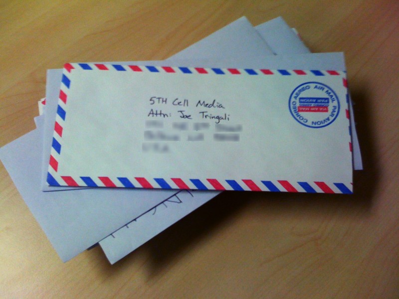
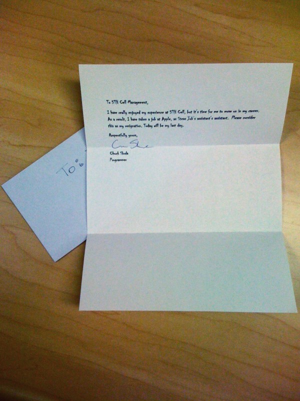
Today Joe, our Managing Director, came into his office to a stack of letters, resignation letters — from everyone in our company. It was prank on Joe and us at the same time. Someone, still unknown, handcrafted letters for each employee that are both comical, and personally relevant. ‘My’ resignation letter, typeset in Chiller, reads as follows:
To 5TH Cell Management,
I have really enjoyed my experience at 5TH Cell, but it’s time for me to move on in my career. As a result, I have taken a job at Apple, as Steve Job’s assistant’s assistant. Please consider this as my resignation. Today will be my last day.
I’m interested to see how much of an issue this is, and if nothing else it will make icon design even more important on iPad than it’s been on iPhone. (via Shawn Blanc)
Great article by Stephen Fry for Time. Here is my favorite exchange from Fry speaking with Jonathon Ive, Senior VP of Industrial Design:
I put to designer Ive the matter of all the features that are missing from the iPad. “In many ways, it’s the things that are not there that we are most proud of,” he tells me. “For us, it is all about refining and refining until it seems like there’s nothing between the user and the content they are interacting with.”
Phone calls, texting, and everything else that requires the cell radio or GPS constitutes less than 20% of what I do with my iPhone. To me it already is a device for media consumption, mostly reading, and lots of it. Reading news feeds, tweets, emails, blogs, and the vast reaches of the web are really the key functionality that I get out of my iPhone. If the activity of reading alone is a 20% better experience on the iPad, then even a Wi-Fi only model is at least as valuable to me as my phone.
But reading won’t be 20% better. From all the videos, tours, and previews, reading looks to be far and away better on iPad than it is on the iPhone. It’s clear that making reading a better experience is the cornerstone of the device. From its magazine form factor to its new bookstore, the iPad is geared towards making reading on an electronic device more simple and effective than ever.
The ‘phone’ component of my iPhone is really the least significant part of the device to me. I’m not planning to dump my iPhone anytime soon, but I easily see spending more time with my iPad than any other electronic device outside of my work computer.
These new guided tours posted by Apple this morning look amazing. In particular, I love the Keynote, Pages, and Numbers previews. They make the current generation of office productivity software look terrible by comparison.
It doesn’t matter who owns the trademark, the minute Apple declares the name of their latest gadget, that’s what the trademark gets tied to in the public eye. It becomes practically valueless to be used for any other product.
If you are a developer who is not yet familiar with distributed revision control systems, this is a must read. An absolute must read! I was so confused about git/Mercurial until I read this. Awesome! (via Daring Fireball)
With the widespread media coverage stemming from the recent Wired article on iPhone app payola, it stands to reason that many people will be skeptical about the validity of websites focused on app recommendation. I have a number of sites that I follow for iPhone app critiques with such a high emphasis on design that it’s hard to imagine they are requesting money in exchange for reviews. I’ve seen enough great apps listed that I have pretty good confidence they’re looking for the very best. In case you want some places to keep an eye out for good apps, below is the list of sites that I follow. Most of them are iPhone specific, but some branch out into Mac or other software.
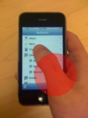
Just the other day I was thumbing through an article in an iPhone app I read with frequently. I was kind of in a hurry, and found myself wondering how close I was to the end of the story. Lo and behold, I couldn’t find the indicator. Where was it? Well, it was right there on the screen — underneath my thumb. For right-handers the placement of the scroll indicators are counter intuitively positioned with a bias toward the corner of the screen commonly obscured by the hand.
The reasoning is obvious. Scroll bars have nearly always occupied this part of a window or content pane in desktop user interfaces. But until recently, this has been a hands-off experience controlled with a mouse. With iPhone OS, scroll indicators are just that — indicators. They usually have very little visual impact, especially considering they disappear when the view is still. I propose that these indicators should favor the opposite corner of the screen along the top and left edges. After all, an ‘indicator’ isn’t doing it’s job if it can’t be seen. Not to leave out left handers, perhaps this would be a good global option in the General section of the Settings app.
Recently I was pointed to Thomas Maier’s site and stumbled across this article on using ‘subpixel hinting’ in Photoshop. This technique gives sharper image quality for almost all standard LCD screens in their standard orientation. So what’s the problem? The iPhone and the iPad. These new classes of device are made to view things in whichever orientation seems appropriate to the user. And with these platforms gaining steam all the time, statically subpixel-rendering assets becomes counter-productive.
The sharpness comes because the images take into consideration the minute differences in position of the red, green, and blue subpixels that make up each pixel. When we start physically altering the orientation of the screen (and thereby rotating the content that is displayed) our work to increase sharpness is not only lost, but in fact sharpness is actually worsened. In the case where the screen is rotated right or left, the subpixel rendering isn’t even working on the same axis as the subpixels anymore, and the even worse case, when it is upside down, the hinting works directly against the physical order of the subpixels.
On top of this issue, screen technology is still rapidly changing. Google’s Nexus One, for instance, has a screen with one green subpixel and one of either red or blue subpixels alternating in each adjacent pixel. Using subpixel rendering to generate assets bakes in assumptions about hardware that are no longer as valid as they once were. Point being, we should rely on hardware advancement to give us better image clarity and fidelity. One day the hardware might demand higher resolution images of us and offset the data for the subpixels dynamically, but we should avoid creating assets only fit for a single display system.
Update: This article was previously using the term ‘subpixel hinting’. It has come to my attention that what I am describing isn’t a correct usage of that term. I was simply responding using the language from Thomas’ article as I understood it. Font hinting is a term for aligning a font with the raster grid of a monitor so that it takes advantage of solid pixel edges where possible. What I’m cautioning against here is generating any art assets with a baked in presumption about subpixel arrangement to prevent improper display on screens of varying orientation. It appears that subpixel rendering is a more accurate term, so I’ve substituted it for subpixel hinting throughout the post. (Thanks to Typographica for the heads up.)
More and more of my electronics use rechargeable batteries. I thought I’d look up Apple’s recommendations for how to make them last the longest. Here are some quotes from their website:
For proper maintenance of a lithium-based battery, it’s important to keep the electrons in it moving occasionally. Be sure to go through at least one charge cycle per month (charging the battery to 100% and then completely running it down).
Apple does not recommend leaving your portable plugged in all the time. An ideal use would be a commuter who uses her MacBook Pro on the train, then plugs it in at the office to charge. This keeps the battery juices flowing.
My iPad was officially pre-ordered mere seconds after the Apple Store came back up at 5:30am this morning. I went with the 16GB WiFi-only model. In case your curious here’s why:
I have an iPhone with 3G & GPS, and I plan on having one for the foreseeable future. To me, my pocket device is really where GPS and a constant internet connection are useful. My iPhone is where I want to get notifications, whether texts, calls, or emails. For instant communication anywhere, it’s still the go-to device. That, and the extra months wait, $130 price tag, and $30/month service make the WiFi model a no brainer for me.
I’m starting to realize I’ll never have enough storage in a highly portable device to store all of my media. And if I can’t have it all, then having 16GB of it isn’t much more of a compromise than having 32 or 64 gigabytes of it. Apple always charges a seemingly unjustifiable premium for storage in their portable devices as a way of differentiating price-points. It just doesn’t necessitate an upgrade for me.
Chances are, this isn’t the iPad I’ll have five years from now — maybe not even two years from now. I can wait it out and let the changes come to me as they trickle into the baseline models of future generations of the iPad.
It was the option that made sense for me, and maybe I’ve helped inform your decision if you’ve been thinking about getting an iPad. Now hurry up April 3rd!
This weekend I read a great article by Matt Gemmell aptly titled iPad Application Design. He has a lot of great insight into what applications should look like on the device. In particular, he brings up globally-positioned editing UI, and shows some examples of how cluttered many interfaces have gotten on modern desktop machines. He points to how much more effective contextual controls can be on a device like the iPad.
Context menus are something I have come to realize that Windows handled better than Mac, heavily due to the convention of a two button mouse, which Apple seemed to so vehemently oppose. But application code has been object oriented for such a long time now, why haven’t most of our interfaces become object oriented? I think for a great deal of our tasks, contextual interfaces make more sense than globally-positioned controls.
This weekend I started playing Plants vs. Zombies by PopCap Games on my iPhone. On Friday at work a number of fellow employees were encouraging me to try it out, but I work at a videogame company, so game recommendations are white noise. Until Rob spoke up (@vash18). He heard the conversation over the cubicle wall, and sent me an instant message saying, “you owe it to yourself to play Plants vs. Zombies.” That sounded like a pretty bold statement, and it was enough to yield a purchase. Why not, I had some credit lying around in my iTunes account.
Plants vs. Zombies is a tower defense game. My personal favorite of our games at 5TH Cell, Lock’s Quest, loosely falls into this same category. Enemies approach your base, and you set up defenses to protect against them. In PvZ, enemies = zombies, base = your house, and defenses = plants.
PopCap is a well respected studio. They’re known for having a pretty dominant position in casual games. Admittedly, I haven’t been much of a gamer in recent years, but PvZ has really caught my attention. This game really makes the iPhone shine as a platform for games. It feels as though PvZ is much more at home on iPhone than it is on the PC.
Many traditional gamers and developers haven’t taken the iPhone OS very seriously as a gaming platform. If it can’t support game genres that we’ve grown to love on other platforms, then it doesn’t quite stand up. When a new system comes out, we tend to view it through the lens of the history of videogames. What would Halo be like on this? How about GTA, or Mass Effect? But when we try to imagine our favorites on the iPhone, they just look like hamstrung versions of their console counterparts.
And it’s true. The iPhone wouldn’t support such games as we know them. It doesn’t have the power, or the input mechanisms that they’ve been built around. But just because the platform isn’t the logical step forward from the systems of yesterday, we can’t write it off. Look at the Wii. That caught us all by surprise, and you can’t deny it’s success.
Plants vs. Zombies really shows off the potential for a great gaming experience on the iPhone OS. When I try to think outside of the box of previous generations of games to what kind of experiences could exist on the iPhone, it’s very exciting to me. Now if only Blizzard would port StarCraft II.
Last week I asked my twitter followers what tweets are called in Google Buzz. Buzzes? That’s a lame term if you ask me. Today I stumbled across the Wikipedia entry for Twitter, and found this interesting quote from Jack Dorsey on the naming of Twitter (emphasis mine):
The working name was just “Status” for a while. It actually didn’t have a name. We were trying to name it, and mobile was a big aspect of the product early on … We liked the SMS aspect, and how you could update from anywhere and receive from anywhere.
We wanted to capture that in the name — we wanted to capture that feeling: the physical sensation that you’re buzzing your friend’s pocket. It’s like buzzing all over the world. So we did a bunch of name-storming, and we came up with the word “twitch,” because the phone kind of vibrates when it moves. But “twitch” is not a good product name because it doesn’t bring up the right imagery. So we looked in the dictionary for words around it, and we came across the word “twitter,” and it was just perfect. The definition was “a short burst of inconsequential information,” and “chirps from birds.” And that’s exactly what the product was.
Coincidence? I doubt it. It looks to me as though Google lifted the name for Buzz, it’s new status update engine, from Twitter’s discarded table scraps. You lose 3400 points for lack of originality Google.
Earlier today I became curious about the pixel density on the iPad. I ran some numbers of today’s Mac product line.
Device
Pixels Per Inch
iPhone
165
17” MacBook Pro
133
iPad
132
13” MacBook Pro
113
15” MacBook Pro
110
27” iMac
109
21.5” iMac
102
The iPad compares favorably for pixel density with the entire Mac lineup. The iPhone is definitely ahead of the pack, and it shows in the smoothness of rendered text.
There is an important note for developers to remember, especially before you have your hands on the device. Any given graphic on the iPhone will already appear with more than 1.5 times the physical area in 2 dimensions when it’s displayed on the iPad. So they will already be easier to touch, for what it’s worth.
My friend Chris and I were having a discussion about the iPad this morning. We hadn’t talked about it yet as he’s been out of the country for a few weeks. He brought up a question about printing. I just so happened to come across this article from the Macalope today for the first time.
The iPad is something different. The iPad is small and cheap but not weak. It’s focused. And yet it fills a hundred niches a crappy plastic laptop never could. One of the complaints in Wilcox’s piece is how do you print from iWork? Who needs to print? Good lord, if Apple could kill printing they’d be doing us the single biggest favor in the history of all mankind. But here you have a device that a salesman and a customer, a doctor and a patient, a lawyer and a client, an Indian chief and a Pilgrim can sit down at together. They can pass it back and forth. This device is intimate; it brings people together. And if someone needs a copy, you e-mail it to them. Printing? 1997 called and it wants its ink cartridges back.
It’s funny, it seems that the issues that we all (myself included) keep bringing up about the iPad eventually fade into the idea that maybe we ought to be shaking off how we used to do things. We’ve spent decades building all these assumptions about computing that we forget to step back and look at the problems they’re solving. This happens to me in programming. I get so focused on my current issue, that I forget to widen my view and see the beautiful solution that’s way further up the pipeline.
Maybe I don’t need to print. I have a printer at home, but really all I use it for is printing pictures size 8″x10” or smaller. I could actually send those to Costco, and have them done cheaper (ink and paper are expensive) at significantly higher quality. Where can I take a paper “hard” copy that I can’t take my iPad? Maybe we have been cutting down too many trees. I don’t know. These are just a few of many new ideas to think about. And to me that’s one of the intriguing things about the iPad. It shatters preconception; it holds no de facto rule about computing as sacred. I think it’s high time we rethought some of these things.
There has been no shortage of talk about the iPad. I wanted to collect some of the more meaningful, pointed, and influential blogs concerning the device. John Gruber has been posting lots of links to some great reading about the iPad at Daring Fireball. In line with his posts, I thought I’d make a list of some blogs that “get it” and some that don’t get it. Most of these were found at DF, but I have thrown in one or two that I’ve came across digging around elsewhere.
This isn’t to say that those who don’t get it are all wrong, or even way off base. But their vision of what the iPad will change is incomplete, and in many cases inconsistent with what has happened historically.
When the first Mac came out, it didn’t obviate the usage of more traditional command line computers. At the time these text based computers were the sole domain of the geek elect. In fact, if you still know one of these people, chances are that to this day they still spend a good part of their computing life at the command prompt. No, the first Mac didn’t preclude these earlier devices. What it did do was introduce computing to a larger circle. People who realized the practical benefit of computers, and were less intimidated by this new desktop/keyboard/mouse interface. The accessibility drew them in.
This is the space we’ve been living in for the last 25 years. The fundamentals of computing haven’t changed. Computer usage has still grown despite the lack of a major user interface revolution, but there are other reasons for that. Namely, the uptake of the Internet vastly increased the “practical benefit” that people saw in computers. And as computers achieved relative ubiquity, people had a growing support system for computing in their friends and family. In fact, you’re probably one of these people yourself. Your expertise has probably at some point enabled someone to use a computer where otherwise they would have been lost.
Now here we are. On the cusp of a new generation of machines. Will the desktop go away? Have command prompts? No, and yes. As the scale tipped toward GUI operating systems, the command line has faded more and more. They’re still around, but terminals and prompts have been relegated to fewer tasks to which they are best suited.
And this is what I see happening again. These new touch computers will slowly absorb the usefulness of the older traditional desktop. As technology improves, as the platforms mature, as competition begins to drive advancement, we’ll see the successors of the iPad become the more relevant computers. I’m not throwing out my MacBook just yet, but I sure left DOS behind quite a long time ago. I’m looking forward to the day when I edit photos, author a website, and yes, even write my first program on a tablet. Bring it on.
Regarding the iPad shortly after it’s unveiling Wednesday, Holmes Wilson of the Free Software Foundation said:
This is a huge step backward in the history of computing. If the first personal computers required permission from the manufacturer for each new program or new feature, the history of computing would be as dismally totalitarian as the milieu in Apple’s famous Super Bowl ad.
Many people were crossing their fingers that the iPad would have an open environment for distributing apps. Something like Macintosh and Windows PCs have had since their inception. Aside from the obvious benefits to Apple in having an app store that supports their hardware platform with a cut of software sales, the App Store is a great benefit to both consumers and developers.
consumers
People don’t buy software. Now that’s a gross generalization. Obviously, some people buy software. But really, only under very specific circumstances. Maybe you need to buy Word so you can edit your work documents at home. Maybe you, like me, suffer from an addictive hobby like photography and need Photoshop or some reasonable facsimile. But your average Bob, Joe, and Sally… they don’t buy software. In this article (profanity, be warned), Guy English of Tapulous states:
“Software” is dead, don’t bother putting that word on a sell sheet. Have you written “a program” recently? That’s nice, find a place in line behind all the other nerds but try not to step on the Coke-bottle glasses they tend to drop. “Oh … you’ve developed an application … is it something my doctor would know about”? People, lots and lots of people, people who have no idea what software even is, will download Apps like they’re snacking on potatoe chips.
Why is this the case? Well, there are a number of reasons. I can think of a few.
Safety- Your Mom and Dad, your cousin who is a contractor, your friend’s son on the varsity football team, all have heard horror stories about viruses, spyware, and identity theft. In fact, they very well have experienced these horror stories, and lived to tell about them. The App Store is a very comforting environment. There is no fear. The ‘app’ you’re downloading has been well looked over. It’s not going to steal your bank information, it won’t delete all your files (it can’t), and it’s not going to flood your computer with popups and background processes that slow it down. I’ve been using computers since I was old enough to sit at a desk chair, and I know very well how to avoid these problems. But even to me, the thought of buying something from the App Store is comforting.
Simplicity- When the iPhone first came out, the ease of the interface surprised us all. You must admit, it was a giant leap in human-computer interaction. Pointing and touching things connects with an innate part of what it is to be a human. This has led to software that is within the grasp of anyone. No complicated commands, no keyboard shortcuts for power users. It’s a level playing field, accessible to everybody. Don’t believe me? Watch this video of a one-year-old using an iPhone:
Installation- Finding and installing software on PCs is a nightmare. There are so many distribution methods, like installing from a disk you bought in a store, downloading an installer file, or a .zip with an executable in it. Or even digital distribution like the Steam online game store. This is all very confusing to people. Maybe not you, you’re reading a blog. You might not be intimidated by finding and installing software, but regular people are. Let’s not even bring up open source software. I know it’s gotten better in the last few years, but it is still not for your average person to discover, acquire, and install software on a regular basis.
Average consumers do not see the App Store as limiting. It’s actually freeing! They feel free to explore, experiment, and buy things, totally uninhibited by their non-computer-savviness.
developers
Say you have an idea for your next great Windows application. How are you going to advertise it, distribute it, charge people for it? Post it on your website, and link everyone on twitter? PayPal? Donation based? Shareware? Try to find a publisher that doesn’t think your idea is stupid, and fail to cut a good deal because you aren’t a business person?
Now let’s see how this looks on the App Store. I have a great idea. I can make this really great app. It will have a touch interface that everyone can pick up quickly. Once published it will instantly be available to millions of people. It will likely show up in the “New” apps section, on the front page of the App Store in front of a million eyes. The only publishing fee is a flat 30 percent of sales, which is very likely less than a developer is able to negotiate from a traditional publisher. As covered above, there is very little in the way of consumers buying and downloading my app. It’s a scenario they’re very used to.
How is this not a good idea? Unless, perhaps… are you one of those software pirates? Rest assured. The iPad will be hacked. It will support multi-tasking, you will be able to illegally download all the programs you want. Someone will release a browser with flash. And you can quit crying. In fact, now you won’t even need to pay for a phone tied to a long-term contract!
conclusion
Everyone I hear complaining about the iPad is really just someone who is so deeply invested in their current computing platform, they can’t bear the thought of letting go of the things they hold dear. I appreciate the sentiment, but really, we need to move forward.
Now I’m not hoping that Apple becomes a monolithic company. I don’t want using my computer to feel like participating in socialism. But you know that won’t happen. Other people will step up and take a piece of the pie. There are Android based tablets that will be out even before the iPad. Maybe Google Chrome will shift focus a little to take this new kind of computing into account. Maybe the Microsoft surface technology will be worked into a new handheld device.
In any case, computing is changing. In my opinion, for the better. I’m on board.
post script
Let’s not forget that there is a free and open way to release apps on both the iPad and iPhone. They’re called web apps. Ask Google about them. They just released a Google Voice web app to circumvent their native app’s rejection from the App Store. Further, look at Chrome OS. Google is building an entire operating system around web apps. Clearly one of the most influential tech companies in the world thinks they’re going to become a big part of how we use computers.
People keep talking to me about the iPad. I suppose it’s my own fault for posting so many links and comments about it, but I wanted to write some thoughts that address many of the common issues that people have been bringing into question.
The iPad is not a big iPhone. Truth be told, the iPhone is actually a tiny iPad, with a cellular phone tacked on. That might be hard to come to terms with being that the iPhone was released first, but there have been many reports that development of a tablet computer has been going on at Apple for the better part of the last decade. So, even though it’s fun to say, stop calling it a big iPhone.
Sean Sperte recently posted a blog addressing the iPad in which he said:
What I’m getting at is that I don’t think the iPad is just another portable device that fills a gap. Even contrary to the way it was introduced, I don’t think the iPad fits the in-between-smartphone-and-PC moniker. I think it’s much more. I think it is the new PC — in its infancy.
Sean is absolutely right. The iPad is Apple’s way of telling us that the interface they brought us with the iPhone is really what they envision powering the next generation of computers. In the introduction video they posted yesterday, Jonathan Ive, Apple’s Senior Vice President of Design declared:
In many ways this defines our vision, our sense, of what’s next.
In a way, they see their touch operating system being to the current generation of computers what the keyboard, mouse, and window system were to the text based systems that preceded them.
And yet outcries abound. Wired just posted an article called Ten Things Missing From the iPad. They point out all the usual suspects that tech geeks aplenty have been complaining about since the iPad was unveiled: no flash, multitasking, keyboard, etc. The issue is that everyone expects these things to be in the iPad, because they’re in the computers we have now.
Well, the iPad isn’t the computer you have now. Frankly many of us have forgotten how many issues there are with our computers. We have been so anesthetized to the problems of todays personal computers because of their ubiquity, that we haven’t cared enough to look for a successor.
Back in the day, I remember when multitasking didn’t exist yet. Your computer ran one thing at a time. We presume that because multitasking was such an innovation to computing, then unquestionably it’s better. It almost becomes an unspoken pillar of computer interface design. Well guess what. My iPhone doesn’t have multitasking. Sure, it’s not as feature rich as my computer, but using my iPhone is a hands-down better experience than using my laptop (and that’s a tall order considering I have a Mac). What my iPhone does, it does quickly, beautifully, and in an utterly uncomplicated manner.
Apple wants that same great experience for more general purpose computing. The things they left out that all us techies keep complaining about have been left out purposefully. Some have been left out for aesthetics, some for user experience, and some unquestionably to reach their ambitious price goal. In any case, the iPad aims to offer the best computing experience that you’ve ever had.
Another piece of evidence that proves this is how Apple feels about the iPad was their introduction of iWork. The simple fact that the iPad has a larger screen means that it can do real work, and Apple wanted to show that off. My incorrect prediction was that the iPad would ship with iLife: iPhoto, GarageBand, etc. And while I’m sure iLife applications are on the way, in hindsight, iWork helps Apple present their vision more clearly. They want people to rethink the way they make real applications. What would Photoshop look like on the iPad (heaven forbid). What about Pro Tools audio suite? Final Cut Pro? How about some video games? Madden? Command and Conquer?
The magic in the iPad will be the software. Apple has set a precedent. By releasing iWork they’re saying: ‘Look, you really can make seriously great software on this thing. What can you guys come up with?’ My excitement for the iPad is not because I think it’s the end all for touch computing. The reality is that it’s just the beginning. Again, as Sean so aptly stated, “the new PC – in its infancy.”
Shortly after the announcement of the original iPhone, Steve Jobs made a powerful statement about the dynamic touch interface on the new device.
It’s the first thing to come along since the mouse and the bit-mapped display and take things to the next level.
The mouse and bit-mapped display has been the standard MO since the Macintosh was first introduced in 1984. I believe this statement by Jobs indicates that he believes these touch screen mechanics are going to dictate the next generation of computing devices. This trend is what the Apple Tablet is aiming to continue. I think Apple sees this new interface technology as something that will (long term) marginalize the use of keyboard/mouse systems altogether. They’re making steps one at a time to introduce this next iteration of interface design as marketable devices. The iPhone was just the first step. No one can argue that the iPhone has been anything less than a complete runaway success. We’ll see if the new Tablet will be able to take that success to a larger platform.
Shawn Blanc has posted a lengthy article summarizing all his Apple Tablet predictions. His last statement concerning text input was:
I personally wouldn’t rule out a full-width software keyboard that you touch type onto with all ten of your digits.
Honestly, I cannot see a ten finger keyboard possibly being the main text input method on the tablet. Imagine sitting on the New York subway with your shiny new Apple Tablet. You decide to write an email. You set the tablet down on your lap, bend your neck awkwardly downward, and start typing away in hopes that you wore tacky enough pants that day to keep your tablet from sliding around. To me that’s just not a possibility.
My feeling is that we are likely going to see some new form of text input that we have never thought of before. That would certainly explain rumors of a learning curve.
My mind has been tinkering with speculations about the Apple Tablet for many moons. Everyone is talking about hardware, interfaces/interactions, e-reading, and App Stores. I have my own ideas and contemplations about all of these things. But to me, the real question is what will the tablet bring to the table that’s fresh and exciting to a large audience. There must be something. Apple isn’t just going to sell a big iPhone.
What my logical, Spock-reminiscent brain keeps arriving at as the most likely core, compelling new feature of the Apple Tablet is a touchscreen-centric iLife suite. My brain can’t even begin to conceive how awesome iLife could be as multi-touch based applications: iPhoto, iChat, iMovie, GarageBand! The prospect makes me giggle with delight.
The iPhone has communications down. There isn’t a lot of room for the Tablet to improve upon that (except possibly switching to a cellular data provider other than AT&T). But email, texting, calling, twittering, facebooking, all your favorite communications are handled marvelously on the iPhone. Aside from a “mobile phone, a widescreen iPod with touch controls, and a breakthrough Internet communications device” (Steve Jobs’ initial description of the iPhone), I believe iLife is the most mass-marketable trick up Apple’s sleeve. It’s a huge part of what makes owning a Mac attractive to non-computer-type people. And to bring that into the mobile space in a satisfying new way could be a huge hit.
Also, Apple always likes to set the precedent of what the software will look like on their platforms. They want developers to follow their design cues. On the iPhone that meant making apps like Mail, MobileSafari, and Weather. When you break down software on the iPhone, much of what you have are amazing widgets. But if they’re releasing a new 10-inch device, there needs to be a trendsetting, substantial line of software to go with it. The iLife suite totally fits the bill. As great as their hardware is, software has always been the most compelling reason for playing in Apple’s court. The same will stand for the new tablet. Whatever we see, there are definitely going to be applications that will be compelling to your average everyday person. And to my mind, that’s iLife.
In any case, I’m excited to see what Apple has to offer.
Last week I was discussing a frustration of mine about Dropbox. Frequently, I will drag a file out of a shared folder on Dropbox intending to copy it to a more suitable location for editing, storage, etc., but it instead moves the file to the new location. In the process, it’s removed from the Dropbox folder, and subsequently from the folder on all shared computers.
What I really wanted to happen is what happens when you drag a file out of a different drive. The file is copied, and unchanged in its original location. My friend Sean’s suggestion was (in hindsight an obvious one) make a separate partition for Dropbox.
So I did. I haven’t witnessed a huge number of advantages to this, but it does fix my copy/move problem. It also appeases my own mental delineation between Dropbox and regular files on my hard drive. Conceptually, Dropbox is a separately maintained file structure, mainly for small files and quick automated backup.
If you would like to do this, here are some simple instructions. First you need to create new partition using Disk Utility. I created a seperate partition roughly the size of my available online storage. Then you need to move the Dropbox folder location. The Dropbox option for changing the location of the “Dropbox” folder did not work for me. It failed repeatedly with an error about not being able to copy some files. Instead, I copied the folder manually to the new location. Unlinked my computer from Dropbox, and re-linked it to the new location. You will need to select the option to merge with the existing “Dropbox” folder, which will recognize the files are already there and be syncronized almost immediately.
At first I named the drive Dropbox, and had it sync directly as the Dropbox folder. The problem with this was that the root of a partition has many hidden files such as the trashes folder. This syncs a lot of unneccessary junk to Dropbox, and wastes too much space. So instead I named my drive “Cloud,” and kept “Dropbox” as a sub-directory.
Anyways, it was a good solution for me. If anybody else tries it, feel free to leave your findings in the comments.
Over lunch I read a great article on the Apple Tablet by Andy Ihnatko. He gave what I consider to be a very pertinent observation of Apple’s design process that most people don’t really understand.
You want to try to figure out the UI of the [Apple Tablet]? Go get yourself a comic book, or any other rectangle that measures roughly 10” on the diagonal. Hold it as though you’re reading what’s on the surface.
You see the problem? Your fingers get in the way. Think about how big that surface is, too. That’s a lot of acreage to scan, looking for the right buttons to push.
While you’ve got it in your hands, imagine that it’s a sheet of thin steel. That’s heavy, isn’t it? Hard to hold up for long periods of time.
Think about how a user interface would have to incorporate those observations. Now imagine that you’ve been doing this experiment for four years and not four minutes.
Yesterday, there was some chatter on twitter about flash not being on the iPhone. To me it’s a no-brainer that flash is “missing.”
Think through this same design process with interacting with flash on an iPhone. Go to a few flash websites. See how they interact with your mouse cursor, with hovering over buttons, with keyboard input. Now imagine how any of that works on an iPhone without a keyboard, and without a mouse. It doesn’t, but nearly all flash centers around this type of interaction. It’s not a question of the iPhone’s technical capabilities, or Apple wanting to subvert the ubiquity of flash. It just doesn’t work with a touch device. And if it doesn’t work, then Apple doesn’t ship it.
Yesterday, I jailbroke my iPhone. It was the cool thing to do. There were promises of slick new interface elements and pretty home screens. And, while there were pretty home screens and slick interface elements, there was also a bunch of baggage: extra apps for managing my jailbroken phone, utilities with ‘challenging’ interfaces, and a general feeling that now my phone was dirty.
The fancy new home screen was great, but there were just a few icons to fix. I quickly realized that I would be endlessly dissatisfied, knowing that I could make the changes, update the things that I thought could be better, skin all the ugly apps with new images.
What’s more, I remembered why I use Apple products in the first place. Sure there are a million choices in the PC (Windows/Android) world. I can make things look this way or that. I can download this or that utility. I can use this or that hardware. But really, I don’t want to. I want my phone to be done when I buy it. I want to know what it does, and how I’m going to do it. I don’t want to scour message boards for help when I’m in over my head.
iPhoto works, iTunes works, iMovie works, iChat works, Safari works, Apple stuff works. Sure there might be a program that lets you organize photos better than iPhoto, or a faster music player than iTunes. But my Mac was handed to me preloaded with 98.3% of what I want my computer to do. You can’t put a price on that.
And before I jailbroke, my phone was the same way. So, I restored my backup, and my iPhone is back to normal. All is right with the world.


