the case for repositioning scroll indicators
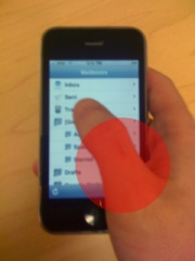
Just the other day I was thumbing through an article in an iPhone app I read with frequently. I was kind of in a hurry, and found myself wondering how close I was to the end of the story. Lo and behold, I couldn’t find the indicator. Where was it? Well, it was right there on the screen — underneath my thumb. For right-handers the placement of the scroll indicators are counter intuitively positioned with a bias toward the corner of the screen commonly obscured by the hand.
The reasoning is obvious. Scroll bars have nearly always occupied this part of a window or content pane in desktop user interfaces. But until recently, this has been a hands-off experience controlled with a mouse. With iPhone OS, scroll indicators are just that — indicators. They usually have very little visual impact, especially considering they disappear when the view is still. I propose that these indicators should favor the opposite corner of the screen along the top and left edges. After all, an ‘indicator’ isn’t doing it’s job if it can’t be seen. Not to leave out left handers, perhaps this would be a good global option in the General section of the Settings app.
Huh, that’s a great point. I’ve never really stopped to think about it but I often find myself trying to pear over my thumb to see where the scroll position is. Definitely an “old design” relic that unfortunately carried across.