itunes window buttons are wrong
Here is a little user interface venting I’ve been meaning to get off my chest. A few weeks ago iTunes 10 was released to a fanfare of ‘meh’s. It had some new-fangled social networking feature called Ping, or something. I’m not here to talk about that. Social networking is so 2009.
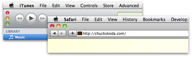
What was disconcerting were the weird vertical close, minimize, and zoom buttons seen here:
Windows are one of the primary system-level components of a desktop operating system. Key examples of this type of component are windows, check boxes, radio buttons, sliders, scroll bars, menus, preference panes, etc. Components at this level exist to enforce platform consistency. This yields familiarity and ease of use. User interface features are elevated to this level when they have a certain degree of importance. For instance, there probably wouldn’t be a standardized scroll bar if it would only be required by one application out of a thousand.
When Apple released the beta of Safari 4, some may remember that it featured tabs on top. Basically, there was no title bar. The space typically occupied by the title bar was now allocated for tabs and divided between them. Taking over the title bar space, common to all main application windows, suggested that the title bar wasn’t important. It’s useful to some applications, but isn’t really necessary for all of them. If something else is more suitable in that space for your application, then have at it.
However, in actuality, title bars are important. They make the window recognizable, contain a title to identify their content, and have a consistent click-able area to move and manage the window on your desktop. Those were all compromised in the beta version of Safari 4. There was an outcry from many users, and the feature was cut from the final release.
These window buttons in iTunes are no different. They are a consistent element in application and finder windows for a reason. iTunes has been Apple’s test bed for unique (read: bad) interfaces for quite a while. Is it any wonder it’s their most complained about and kludgy application?