status bar mania
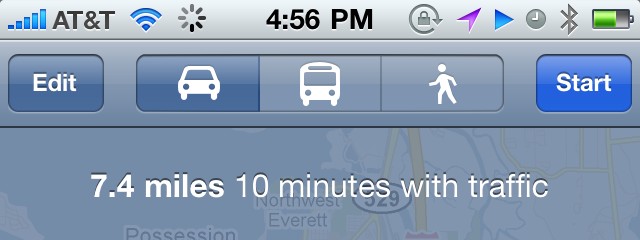
A number of times recently I’ve seen ridicule from fellow Apple enthusiasts toward Android’s hideous status bar. While it’s true in normal situations you’re likely to have a much nicer and less cluttered status bar on an iPhone when compared with Android, the gap is closing. And unfortunately it’s not because Android’s bar is getting better. I whipped up this scenario today on my iPhone:

The kicker is, Apple knows that this is way too many icons. My phone is set to display battery percentage as well, but when too many icons get crammed up there the setting appears to get ignored to reclaim some extra space. Maybe it’s time to rethink which of these things deserve status icons, or maybe even give control to the user which get displayed, as with the icons displayed on the Menu Bar on a Mac.